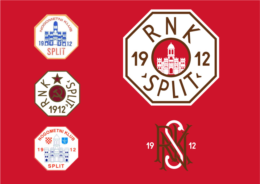
This is a submission for the updated logo for the RNK (workers football club) Split. At Locker Room 51 we only used the elements of the previous crest and created a crest that is free of any political elements with only the crest of the city inside, with the custom font surrounded. The colors of the club are red and white and through the years had blue, black or gold as accent color. We went step farther and took a color of rust as a accent color, to honor the workers (the shipyard workers were among the founders of the club). The secondary logo was created only to show the history of the club, as this kind of logo are associated with clubs with rich history.
