Bahrain Merida Pro Cycling Team

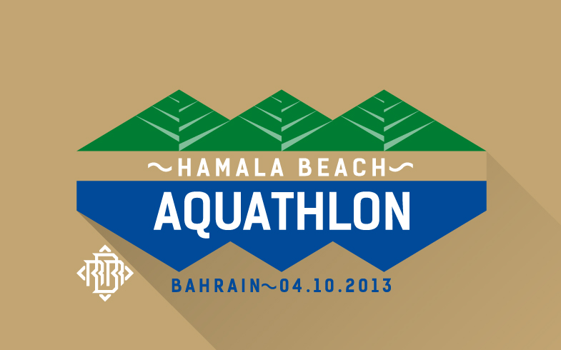
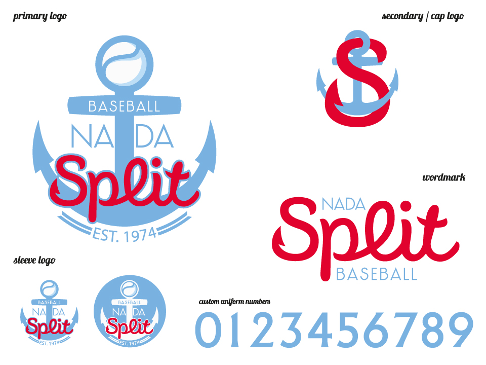
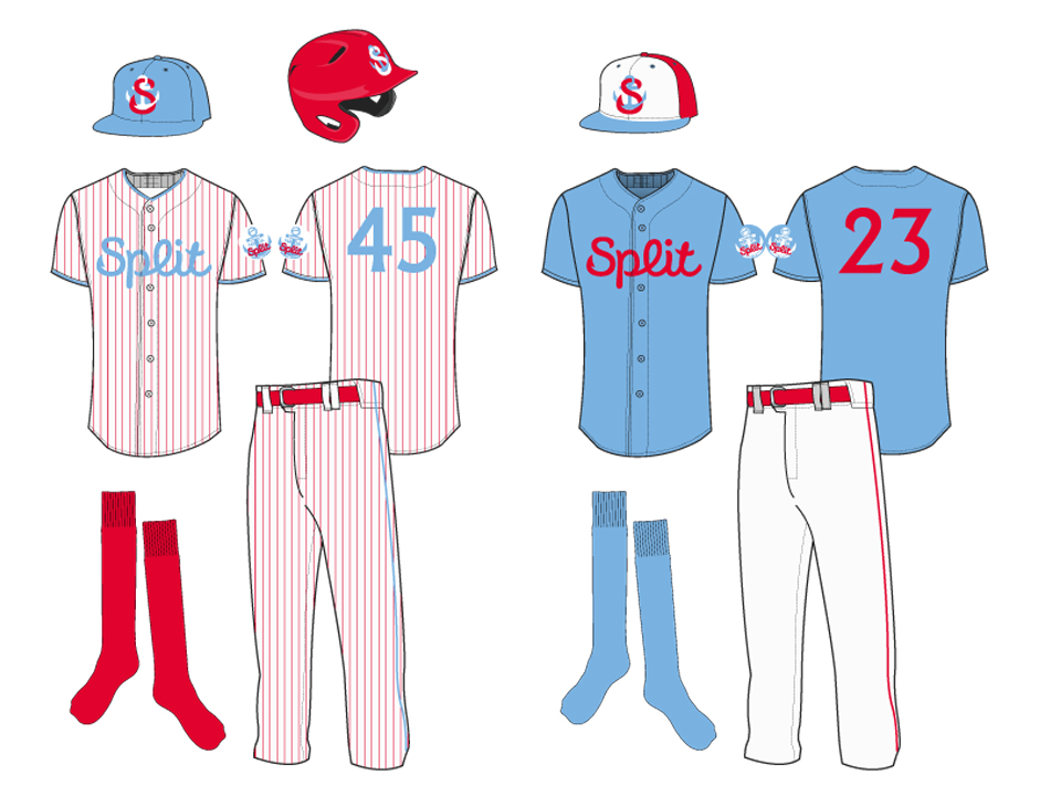
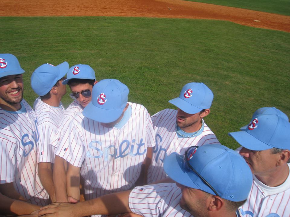
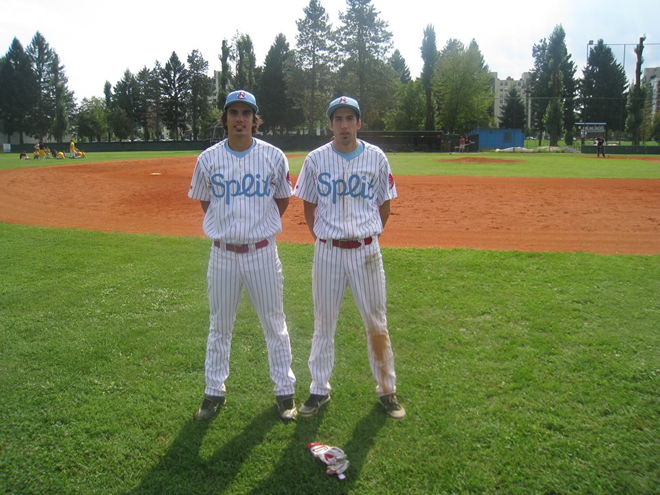
As a Brand Director for the team I was responsible for creating everything from logo and jersey to vehicles and merchandise.

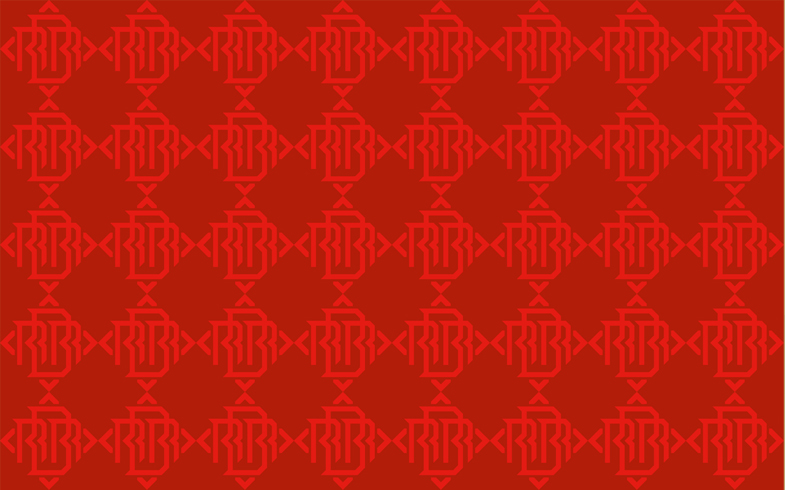
The logo is a combination of metaphors that represents Bahrain, and the spirit of cycling. Circular motion of the wheel is a symbol of invention and progress.

The concentric circles in red represent the dynamic motion towards victory. Furthermore, the national flag with forward-moving arrows blend seamlessly in a form of water ripples, which is symbolic of Bahrain making waves on the world stage.

And at the epicenter of it all, is the culture of Bahrain, showcased by it’s architecture. The heart of the ripple is the golden Arabic pattern that is recognized across the world for it’s rich heritage. The symbol works as a reminder of the culture and values that the nation and the team stand for.

All this complemented by a bold typeface rendered in a combination of ‘Bahraini Flag Red’ and ‘Sea Blue’ – two colours that truly represent the island between two seas.


VIVA Cricket

We were asked (part of Memac Ogilvy Bahrain) to brand the VIVA Cricket tournament and create in-situation mock-ups for the stadium, press conference venue, and everything that goes around it.

The idea was to create visuals that look like cricket branding but little bit more colourful and playful, with heavy VIVA branding. The excessive colour will help with visibility.

The branding identity has been inspired by the jerseys that were previously approved.
Off white has been added to represent cricket and black (neutral colour) to bring a touch of exclusivity to it. Those colours alone with pattern of the jerseys were taken to make a visual effect that will be carried throughout all the materials.

VlogoVjerseyVsquarepatternVbackdrop2VbackdropCricketGroundFlagsPressConference

European Legion – 2014

LR51 strikes again with distinguished uniforms for European Legion, European team of selected under 24 year old Aussie Rules players, that 4th year in a row faced Australian best talent (AFL – AIS Academy). Custom number font was made for this uniform that goes well with subliminal pattern and European Legion logo. AFL Europe Easter Series    Screen Shot 2015-01-06 at 10.49.46 AM Screen Shot 2015-01-06 at 10.43.32 AM    Screen Shot 2015-01-06 at 10.42.53 AM      Screen Shot 2015-01-06 at 10.47.18 AMScreen Shot 2015-01-06 at 10.48.05 AM  Screen Shot 2015-01-06 at 10.45.58 AM    Screen Shot 2015-01-06 at 10.45.32 AM EasterPoster2014-with-sponsors-logos-e1396262214982

Support T-shirts for Hajduk’s fight against HNS

It’s hard to explain what is happening now in city of Split, but all athletes (and public) rallied around Hajduk Split in support of the fight against all irregularities in Croatian football and in Croatian Sport in general. More about that topic: http://bleacherreport.com/articles/2280834-how-hajduk-split-supporters-started-an-uprising-in-croatian-football
But speaking about the design. This job had 24 hour deadline and T-shirts were used the following weekend by all Split’s teams playing their league matches (handball, volleyball, football, indoor football, waterpolo…) The idea was to create a T-shirt that would look like someone took a marker and wrote on it. All revolutions start like that, with bucket of paint and a canvas. This revolution was visible in the Split Center on Saturday where 40,000 people came out with home made banners protesting against Croatian sports irregularities. So the fitting was that T-shirts were in the same style.

10425135_753222131419343_1331338042232669355_n 10525706_753221788086044_5190041888327458902_n 1491650_753221718086051_1864468646262460232_n 10676163_10152402312811644_1083233152614948080_n Screen Shot 2014-11-30 at 10.05.41 1978807_10204475094610364_9177504449989195575_n 1488147_753269201414636_2376389968457397150_n 1795748_362008393973261_678984599436712980_n 10357252_753222184752671_2702298390958188231_n

Bahrain RoadRunners branding


Bahrain RoadRunners is amateur running club on the island of Bahrain. They are the biggest club in the country (member number). LR51 redesigned their look. The new logo is typographical, having the name spelled in Arabic and English. First letters of english name has Bahraini flag feature.

Primary logo:

BRRprimary


Primary logo (color options):

BRRprimaryColors

Secondary logo:

BRRsecondary

Secondary logo (color options):

BRRsecondaryColors

Background pattern:

BRRpattern


Also we created event logos for the club. Each season clubs puts up annual events, for members and non members to participate. There is between 200 and 400 participants at each event. Event logo is used for event give aways for participants as well as for merchandise.

EventAquathlon   EventGPEventCrossIsland BRRredTcrossislandEventHalfMar EventMarathon bottleMarathonEventsAlAreen BRRtribe 1379856_611303232249356_1974615625_n1385661_10151835143750208_539173325_n1381212_10151889516661294_1342571453_n

Nada Split baseball new logo and uniforms

LR51 was asked again to do a rebranding for the club with the longest tradition in Croatia. The brief was to do something that will be timeless and be modern even in 10-15 years. Nada started as red and blue team, in 2000 changed to purple, black and red, and now we wanted to keep the only color that was consistent (red) and add a new color that would make a unique combination, avoiding navy, royal and black as all other Croatian teams wear those colors.

Being a portal city anchor was selected as a logo with interlocking letter S which also represent a hook (long fishing tradition). Letters are not typically baseball letters, but we aimed to make something timeless just like Yankees.

Enjoy the photos, and please let us know your comments.

LOGOS dresovi 1388525_10201586597959753_149199271_n 1387890_10201586597999754_414889364_n 1371466_10201586597559743_1875183478_n 1376005_10201586598159758_770664023_n 1384874_10201586598039755_12723725_n 1371266_10201586597639745_1558402805_n 1393369_10201586597599744_2006983368_n1369139_10201586597919752_456833034_n 560953_4199553460080_230086060_n

AFL Europe designs – year in review 2013

This is the year in review with all designs done for AFL Europe. AFL Europe has many events in the calendar and we are trying to follow them and do branding and design for all.

First we started with Easter Series. Easter Series logo is unchanged, but this year instead of Paris, 2nd game was played in Copenhagen, therefore the light image behind the main logo changed from Eiffel Tower to Little Mermaid, a famous Copenhagen’s landmark. The first match was played in London, 3rd year in a row.

Blue and gold are European colors but gray was added to the mix not to clash with all Blue australian’s kit.

Easter2013Logo

150726_567421066611720_1293442160_n

482684_567422063278287_146768622_n

64248_567423366611490_214571092_n

47028_567422739944886_1646958567_n

544291_567420966611730_1403348562_n

543963_566176436736183_666293801_n

Daniel Flynn – signed by Port Adelaide Power

935168_573778332642660_138464362_n

ANZAC Day has been remembered by footy family as well. Every year the game between Aussie Expats and French team has been played at Villers-Bretonneux. LR51 designed the jumpers for Australian team with a visual of the Gallipoli monument.

532001_573779752642518_1900119233_n

screenDublin2013

European Championship is played every 3 years. In 2010 Denmark and Sweden were hosts, while this time Dublin had that honor. Dublin colors are two blues, while Ireland is green. Combination of those colors we got the pattern that was used in all visuals for the 7 day tournament. THe logo was inspired by the bridges of Dublin.

posterD13

A month and a half after Dublin, Bordeaux was hosting the Euro Cup (Euro Cup is held every year and is 9 a side competition, while European Championship is 18 a side). Hosts didn’t want to mix obvious wine region connotation with sports, therefore logo has nothing symbolic of the region (or city). Bordeaux script is custom made though.

DSC_9355

DSC_9353

65053_646218318731994_567273553_n

1377034_646235435396949_1703013417_n

1385142_646709022016257_1627963036_n

This year Crusaders kits got a small update

1234732_646709002016259_1158146479_n

Austrian Avalanche is still probably the best dressed team in Europe, and they keep improving in performance.

Knights

Croatian Knights got their new kits. The shield on the back stayed, and silver replaced gold for an accent color. But they won bronze, which they admire in the photo bellow.

598620_646709758682850_997431990_n

2012 Euro Cup Edinburgh

Ec12medalEc12t1Ec12t2


Euro Cup is AFL Europe’s showcase event, 9 a side, 16 teams tournament competing at 4 different fields during one day. This is 3rd Euro Cup (hosted so far by Milano, Belfast and Edinburgh) after changing it’s name from EU Cup (London, Hamburgh, Prague and Zagreb). 

LR51 has been involved in doing branding for all tournaments except 1st one in London. We can say that we grew better as tournament grew bigger and better.

Apart for logo design, we did posters, flyers, medals, program, team Europe jumpers and T-shirt design. 

More photos will be added as soon as we get them from AFL Europe.

Medal production by www.pes.hr


South Sydney Rabbitohs proposed logo (Australian Rugby League)

Ssr1Ssr2Ssr3Ssr4

LR51 prposed this logo to South Sydney. In the first photo you see current logo and our proposal done conservativly. Other 3 slides are what we would like to do, more modern and bold. The main change is in the rabbit:

Current rabbit is small, a toddler, vulnarable and will be easily chased away and scared by Broncos, Bulldogs, even Roosters, and will be eaten by Tigers and Panthers. New rabbit has the same face from the old one, same eye shape with meaner look, but is bigger, more muscular, leaps longer, so it’s faster . This rabbit will escape from the paws of the Tigers and Panthers, will frustrate Broncos with it’s speed and will become fiercy animal, just like Swans became in the AFL.

Then in the shape of the logo there is also a change:

The oval shaped logo will be kept, but only in traces. Less is more. Two red and green banners are indicating the oval shape. Banners are used to show traditional element and are honoring the proud history of the club. 

So if you were Russell Crowe would you approve the proposed logo?


JLT AFL Europe All Star Game uniforms and program

Programeuropefin558991_492797187407442_1888771957_n197074_548417698506677_681298269_n534511_548417781840002_1569220984_n396744_548418005173313_2050273263_n559588_548417818506665_2143293527_n10477_548417461840034_943530173_n12697_492796250740869_439426472_n533511_492795527407608_1146753091_n390152_492795230740971_1721188128_n480687_492795580740936_1441859286_n12743_492796187407542_1710005200_n598633_492796377407523_636244245_n542841_492795680740926_117614856_n548957_492795844074243_654256330_n533964_492796547407506_1042236971_n390065_492796707407490_1221959282_n

This is a first instance of JLT AFL Europe All Star Game. It was played at legendary Kia Oval in London as a curtain raiser of AFL Port Adelaide vs Western Bulldogs match. 

Insted of East vs West or Nothr vs South, this game was about Islands vs Continent, Island represented by Ireland, England, Wales, Scotland and Iceland, and Continent represented by other footy nations in Europe.

We decided not to go with typical red, white and blue color for all star matches, and to invent colors that would be more fitting for “Australian” all stars. Islands team has a white jumper with light blue to navy blue stripes representing waves, while continent team has green jumpers with yellow to light green stripes making mountins.

Apart from jumpers, LR51 created logos for the teams and program spread. We hope AFL comes back next year to London to play another match, and that this All Star concept continues.

http://www.worldfootynews.com/article.php/20121106123725556

Uniformed manufactured by S-trend.

Photography (most of those): Copywright Andrew Tobin/SLIK images slikimages.com