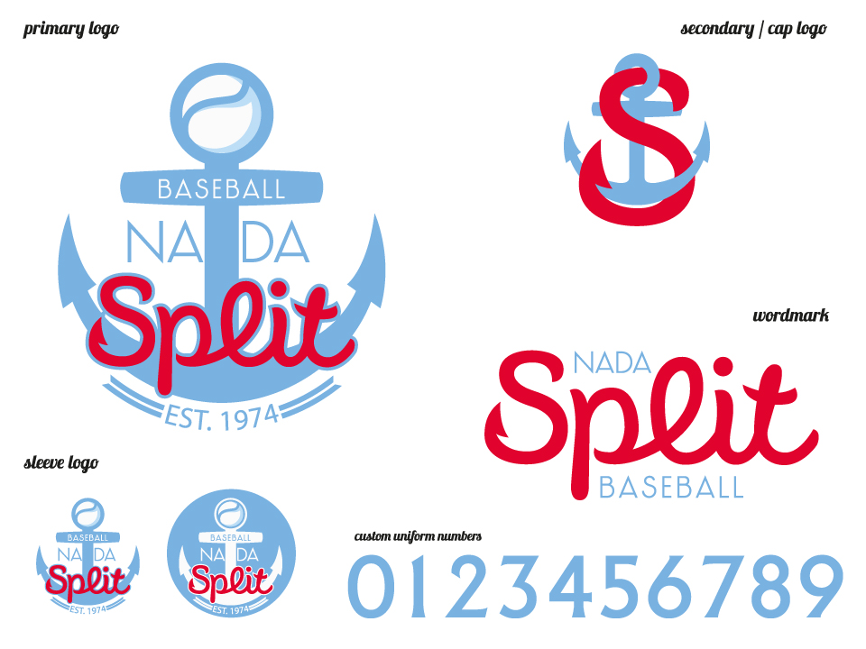
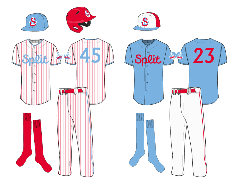
LR51 was asked again to do a rebranding for the club with the longest tradition in Croatia. The brief was to do something that will be timeless and be modern even in 10-15 years. Nada started as red and blue team, in 2000 changed to purple, black and red, and now we wanted to keep the only color that was consistent (red) and add a new color that would make a unique combination, avoiding navy, royal and black as all other Croatian teams wear those colors.
Being a portal city anchor was selected as a logo with interlocking letter S which also represent a hook (long fishing tradition). Letters are not typically baseball letters, but we aimed to make something timeless just like Yankees.
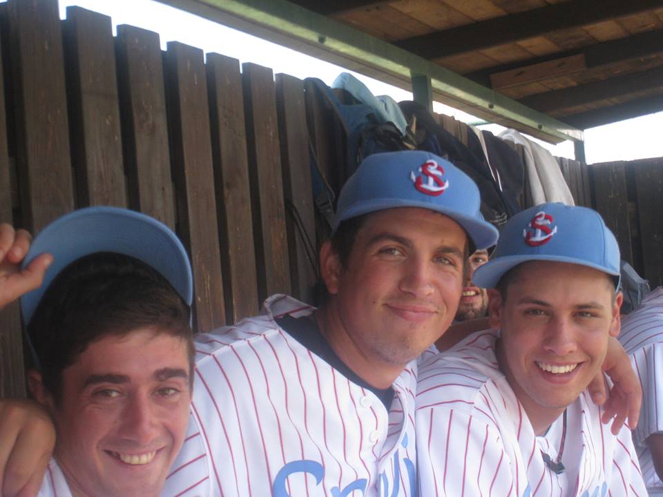
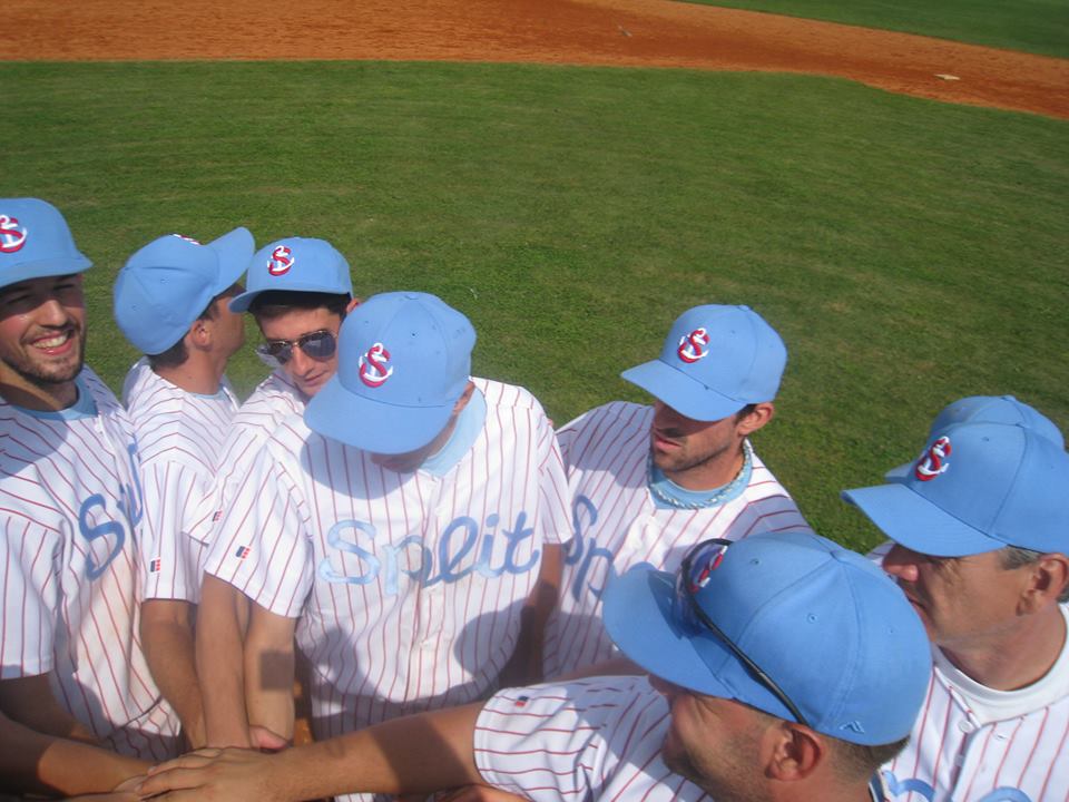
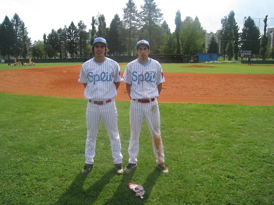
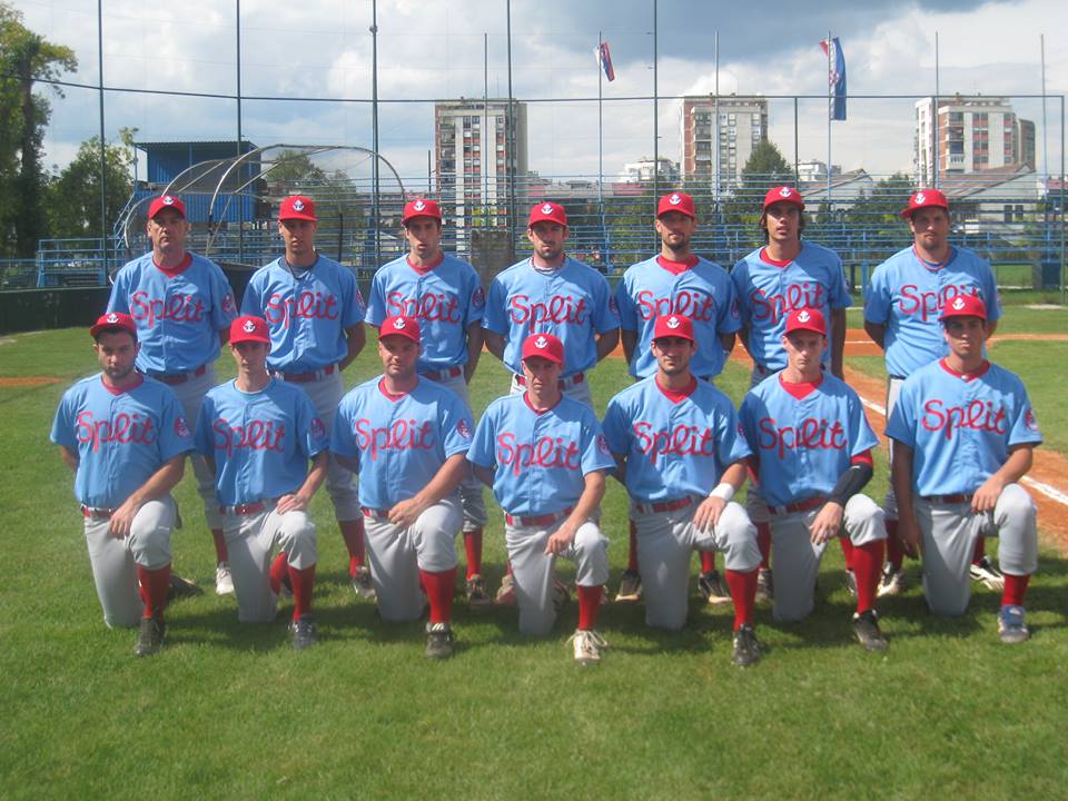
Enjoy the photos, and please let us know your comments.


