This is the year in review with all designs done for AFL Europe. AFL Europe has many events in the calendar and we are trying to follow them and do branding and design for all.
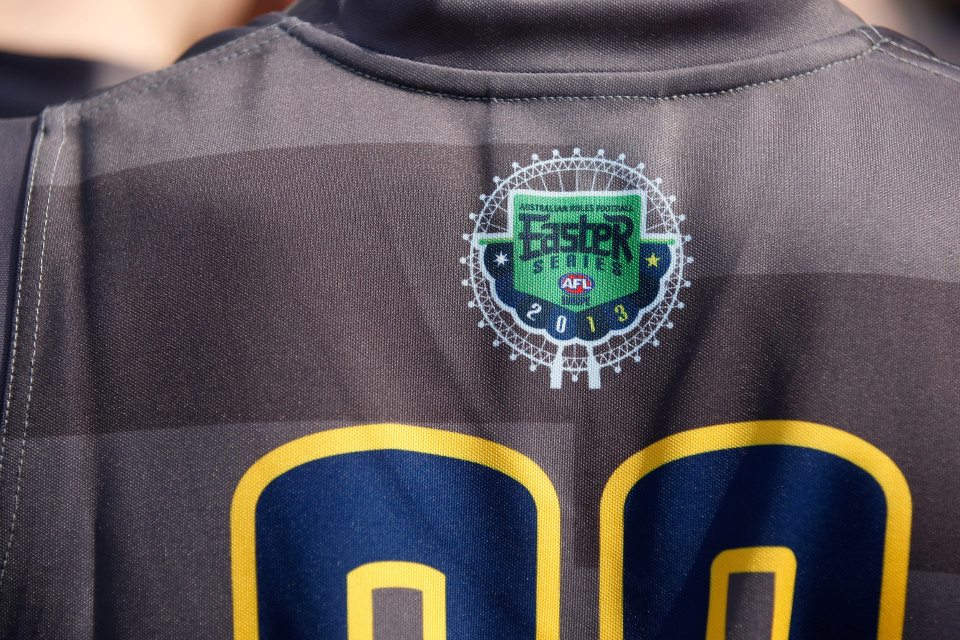
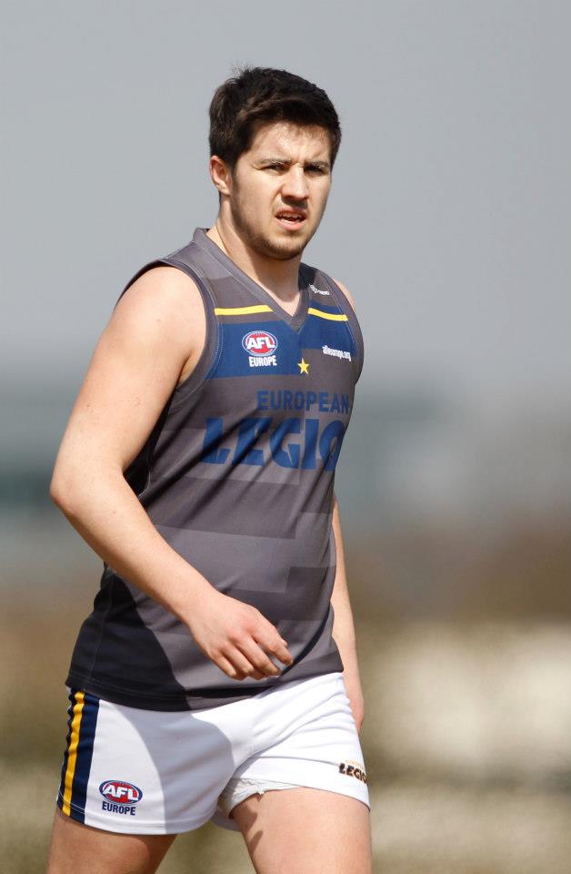
First we started with Easter Series. Easter Series logo is unchanged, but this year instead of Paris, 2nd game was played in Copenhagen, therefore the light image behind the main logo changed from Eiffel Tower to Little Mermaid, a famous Copenhagen’s landmark. The first match was played in London, 3rd year in a row.
Blue and gold are European colors but gray was added to the mix not to clash with all Blue australian’s kit.


Daniel Flynn – signed by Port Adelaide Power

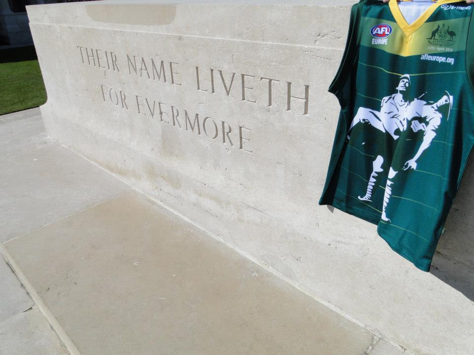
ANZAC Day has been remembered by footy family as well. Every year the game between Aussie Expats and French team has been played at Villers-Bretonneux. LR51 designed the jumpers for Australian team with a visual of the Gallipoli monument.


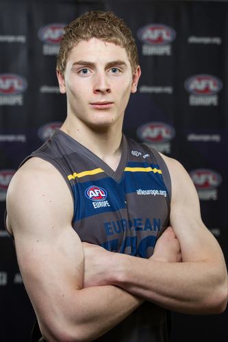
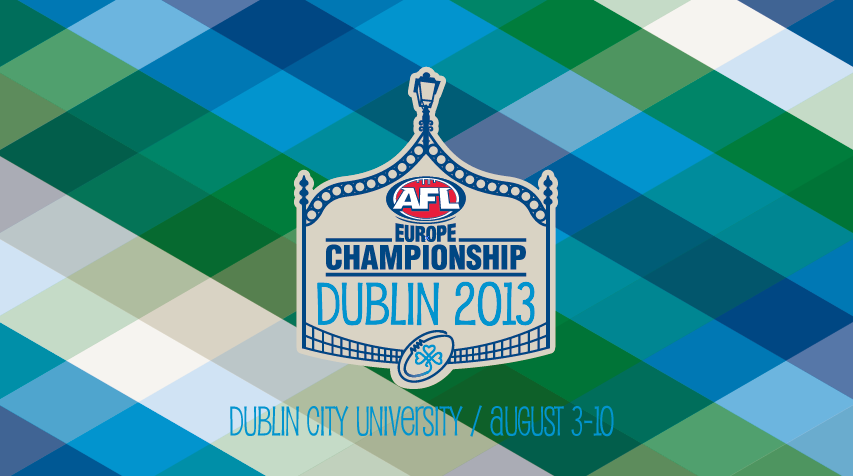
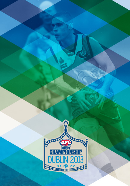
European Championship is played every 3 years. In 2010 Denmark and Sweden were hosts, while this time Dublin had that honor. Dublin colors are two blues, while Ireland is green. Combination of those colors we got the pattern that was used in all visuals for the 7 day tournament. THe logo was inspired by the bridges of Dublin.

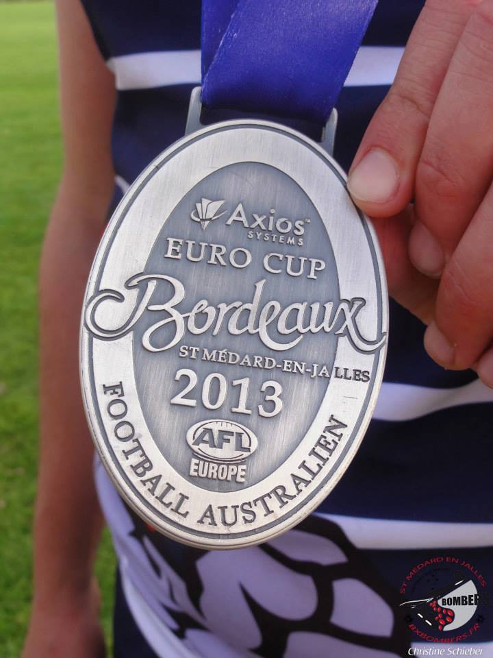
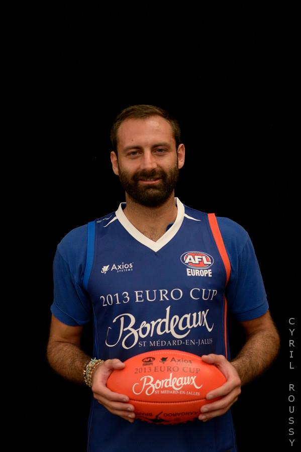
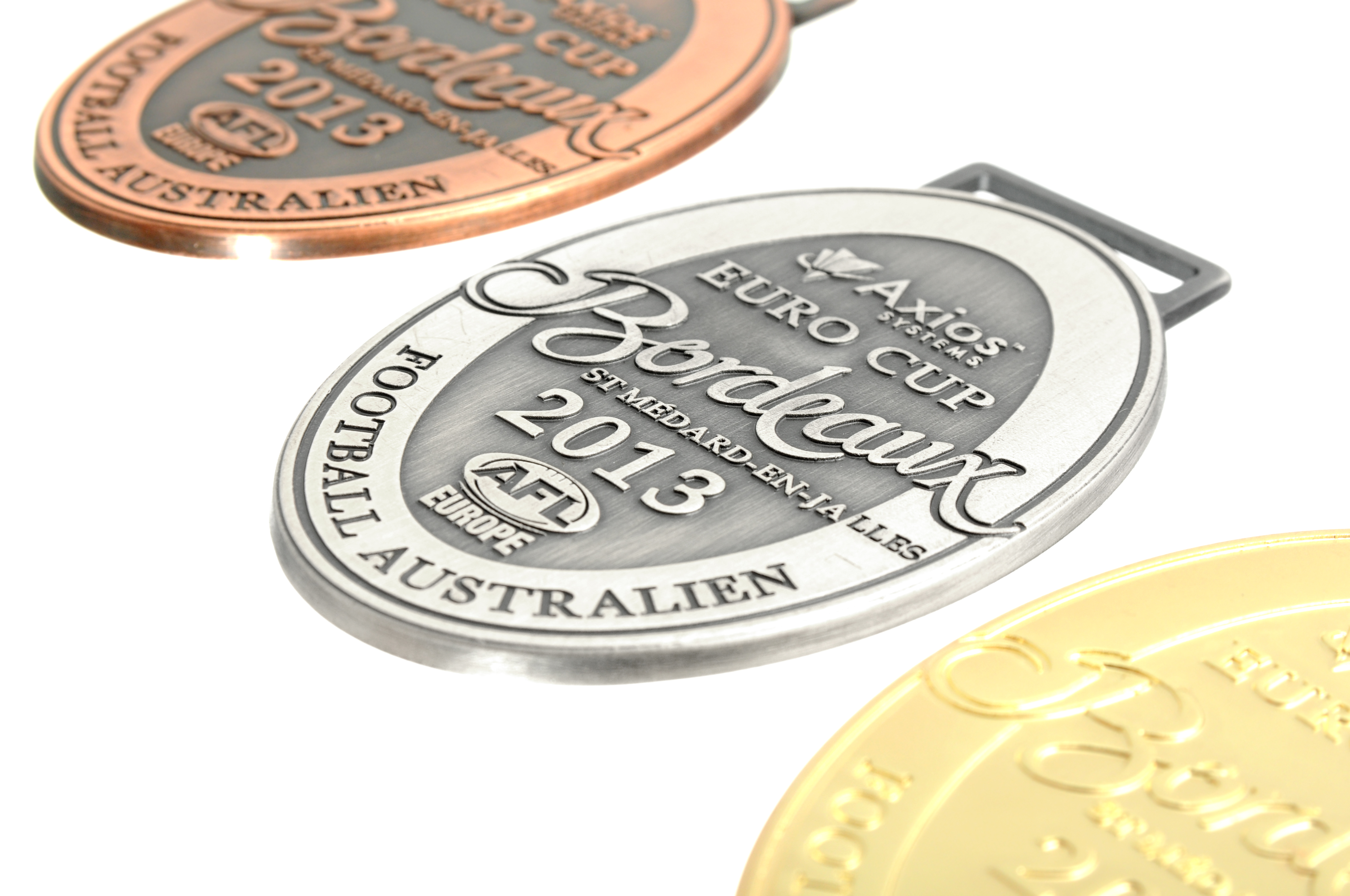
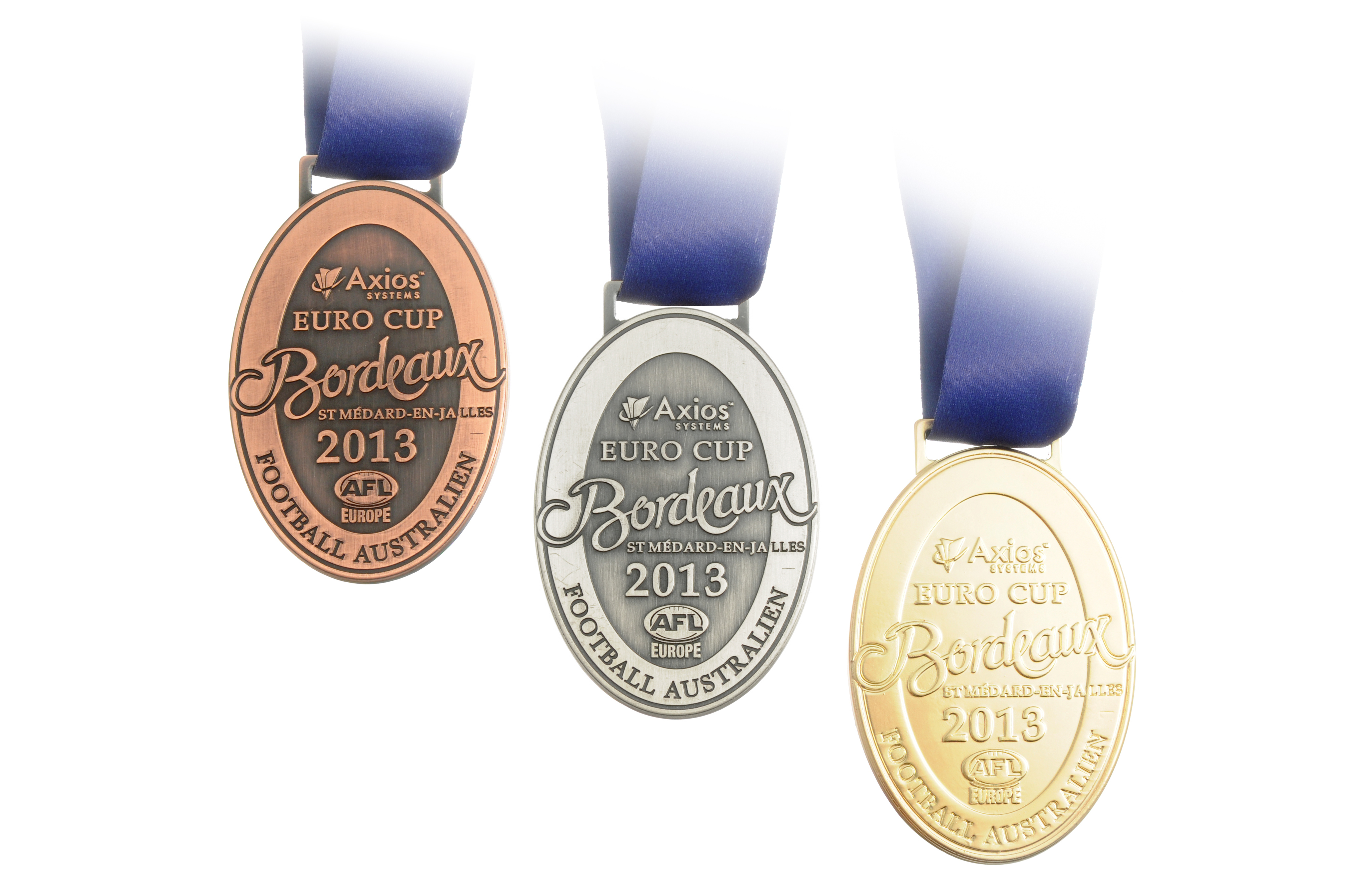
A month and a half after Dublin, Bordeaux was hosting the Euro Cup (Euro Cup is held every year and is 9 a side competition, while European Championship is 18 a side). Hosts didn’t want to mix obvious wine region connotation with sports, therefore logo has nothing symbolic of the region (or city). Bordeaux script is custom made though.


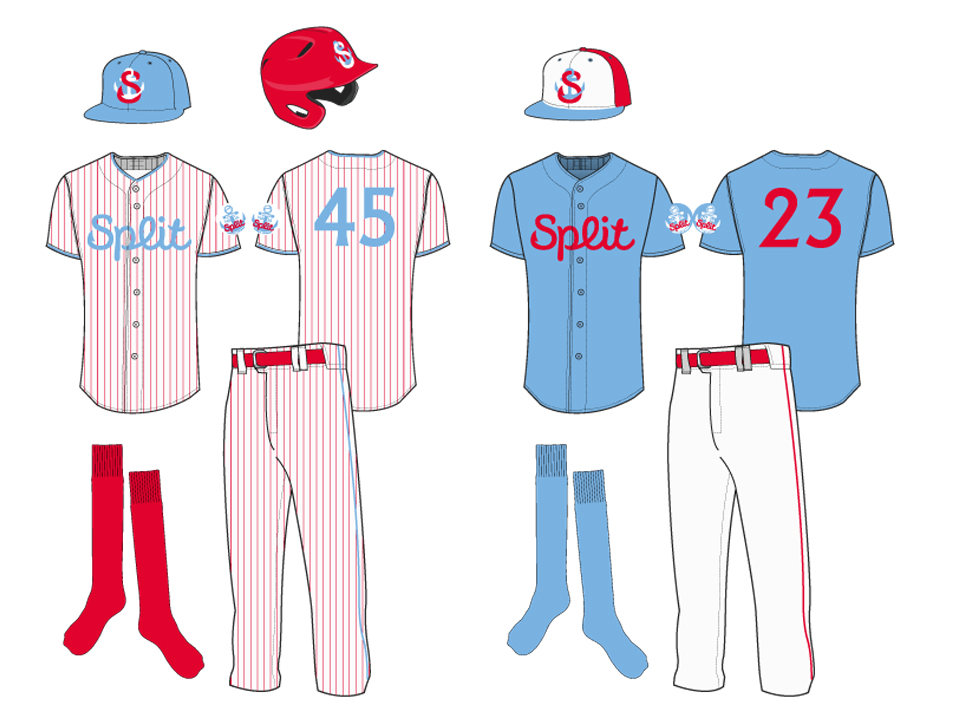
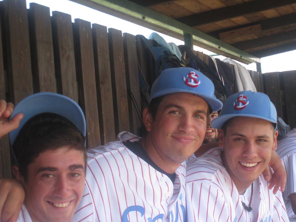
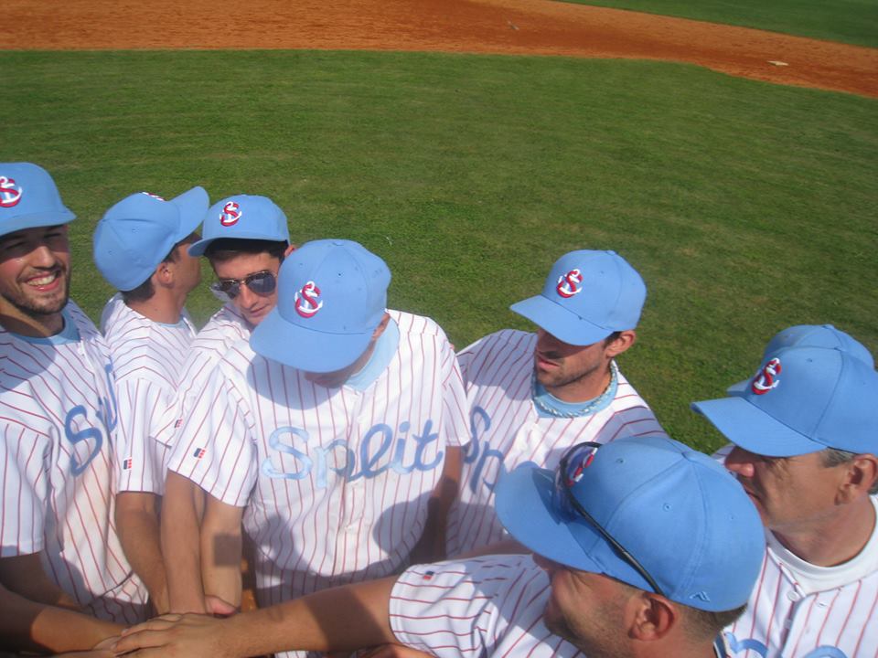
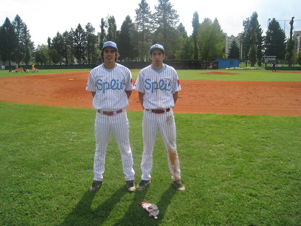
This year Crusaders kits got a small update

Austrian Avalanche is still probably the best dressed team in Europe, and they keep improving in performance.

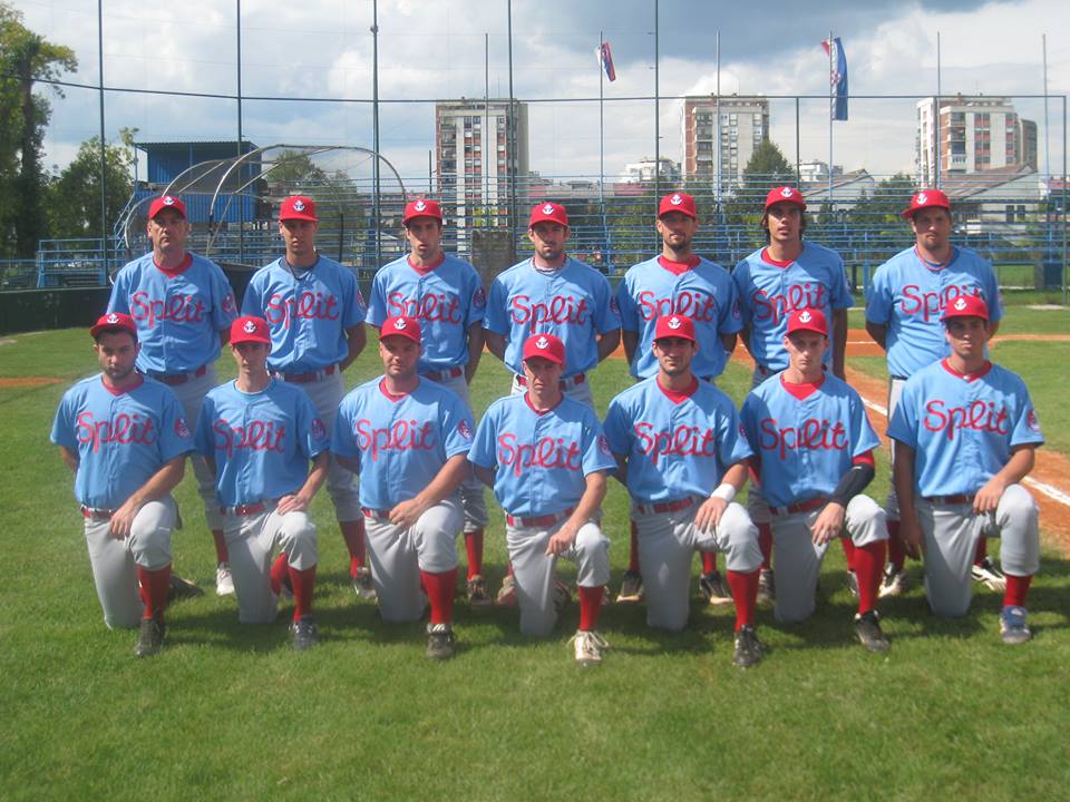
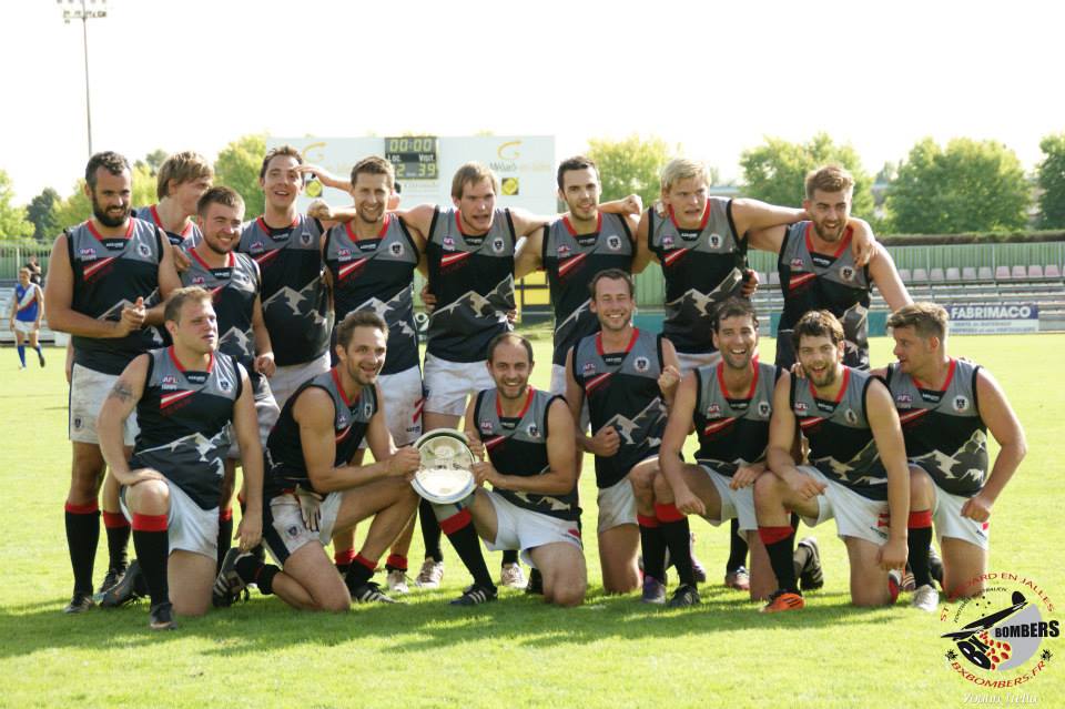
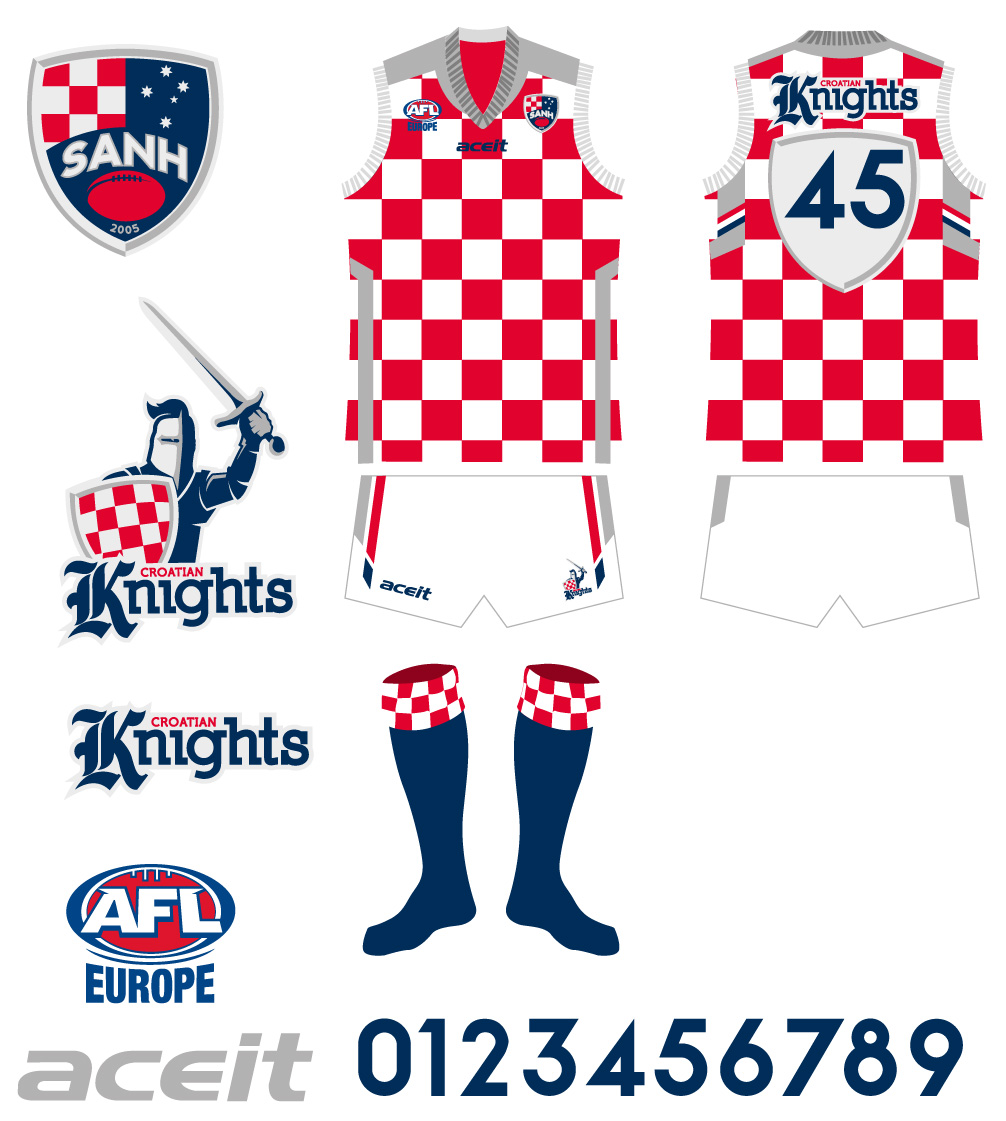
Croatian Knights got their new kits. The shield on the back stayed, and silver replaced gold for an accent color. But they won bronze, which they admire in the photo bellow.


