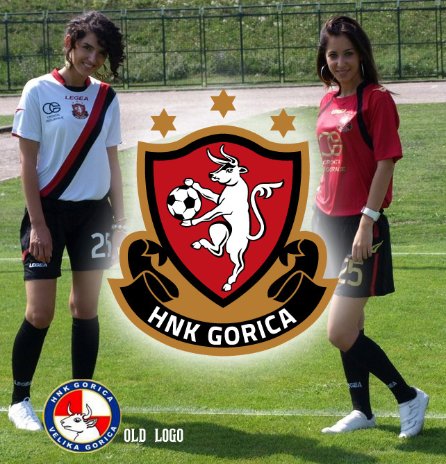
HNK Gorica is Croatian second division team, and so far the were blue and white team, as most teams in Croatia are, and they had a checkerboard pattern in the logo as most Croatian teams have. So at LR51 we wanted to give Gorica a local feel, as we all know they are Croatian team, but we wanted to make local people associate with the club. The city of Velika Gorica has red and black in coat of arm and city flag. Other Gorica teams have red and black as team colors, so we decided to go with that route. We redesigned the bull from the city’s coat of arm and made it main element of the logo. # stars are also found at the city’s coat of arm, while the banner bellow gives a feel of a heraldry and proud history of the club. The new slogan is “my city, my club!” whit which we want to bring Velika Gorica people to the stadium. The championship started last weekend, and at the first game there were 700 fans, which is double the average from last year. The new merchandise is in making and we will post it as soon as becomes available.