
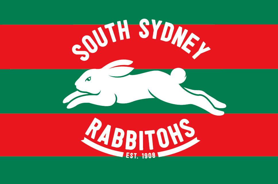

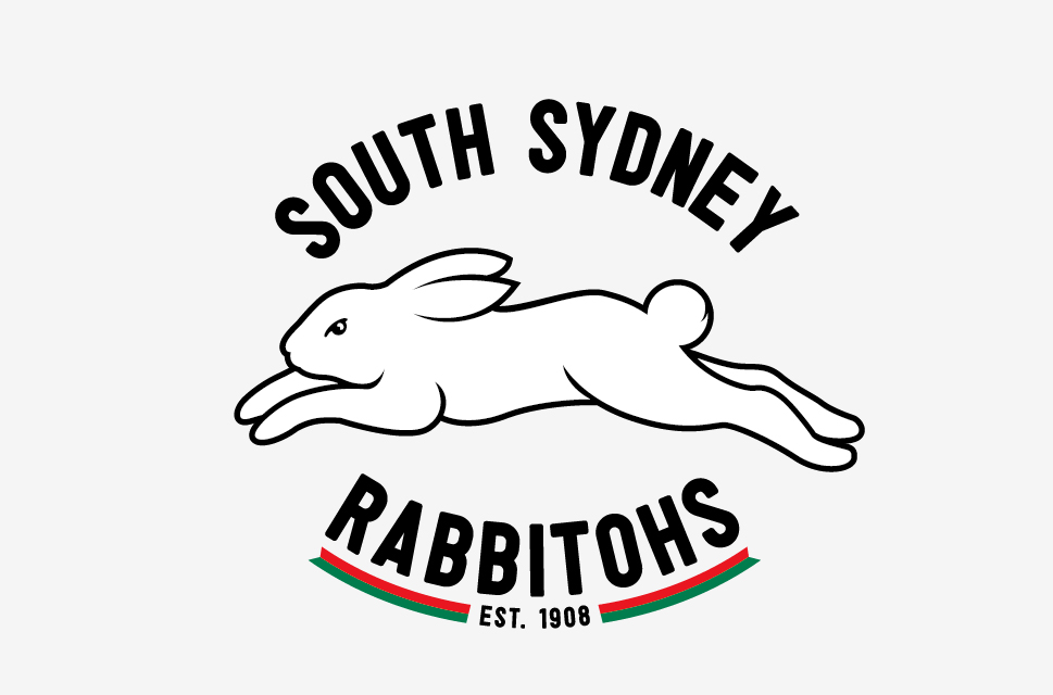
LR51 prposed this logo to South Sydney. In the first photo you see current logo and our proposal done conservativly. Other 3 slides are what we would like to do, more modern and bold. The main change is in the rabbit:
Current rabbit is small, a toddler, vulnarable and will be easily chased away and scared by Broncos, Bulldogs, even Roosters, and will be eaten by Tigers and Panthers. New rabbit has the same face from the old one, same eye shape with meaner look, but is bigger, more muscular, leaps longer, so it’s faster . This rabbit will escape from the paws of the Tigers and Panthers, will frustrate Broncos with it’s speed and will become fiercy animal, just like Swans became in the AFL.
Then in the shape of the logo there is also a change:
The oval shaped logo will be kept, but only in traces. Less is more. Two red and green banners are indicating the oval shape. Banners are used to show traditional element and are honoring the proud history of the club.
So if you were Russell Crowe would you approve the proposed logo?
