
This is logo update proposal for a Croatian Hockey Club. In the corner is their current logo.
This is logo update proposal for a Croatian Hockey Club. In the corner is their current logo.
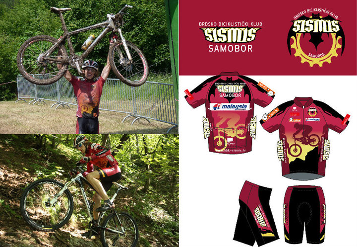
BBK Sismis is a mountain bike club. In Croatian Sismis means bat (animal). LR51 created a logo and race shirts for the club.
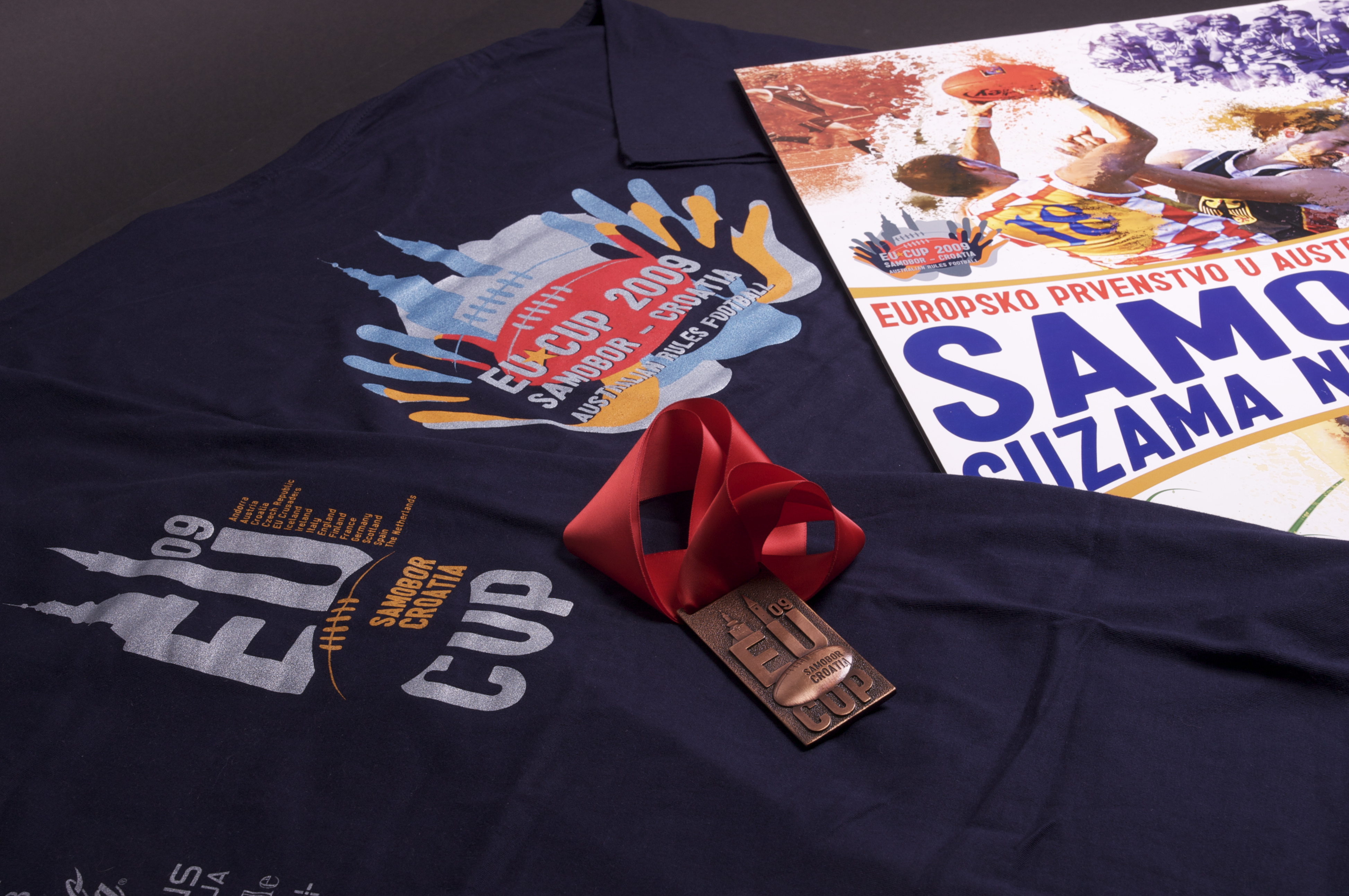


EU Cup is a showcase event for European Australian Football. Samobor in Croatia was a host of the tournament in 2009 after London, Hamburg and Prague. The assignment for LR51 was to bring more people to watch the tournament, and to have more interaction between players from teams. Hard assignment for a product (sport) that nobody in Croatia knows about. To promote event we created poster in line with current EA sports covers for soccer, baseball and other sports video games to attract younger population, and for the members of the team we organized a welcome drink event a night before the tournament and passed out the tournament program for free (usually there is a cost), which was full of information but without any photos. Photos, in form of tickets, were sold separately. They were aiming to bring back the memories of old Panini albums. So players bought packs of stickers, got some doubles and mingled around to swap stickers for the ones that were missing. That created such a buzz that carried on even next day during the tournament and even crowd picked it up and enjoyed swapping stickers. LR51 also created tournament logo, T-shirts, team Europe jumpers (jersey), custom medals and keychains. The tournament went well, about 1000 people came during the day to see a game they never heard about.
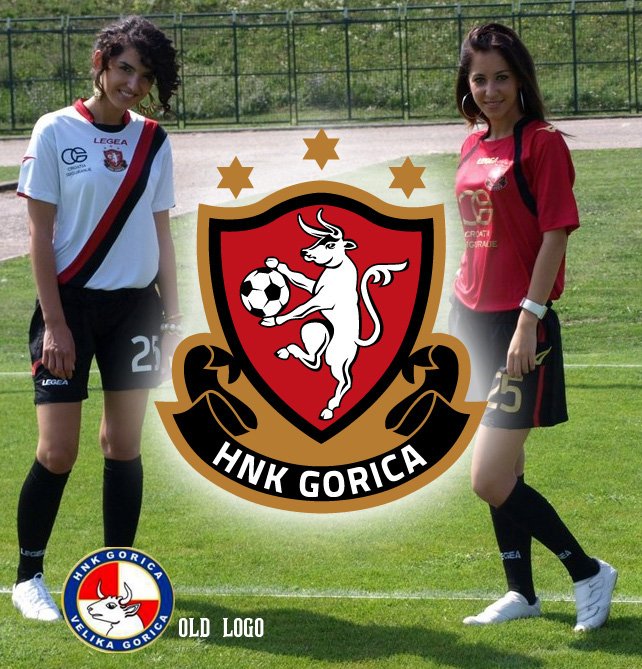
HNK Gorica is Croatian second division team, and so far the were blue and white team, as most teams in Croatia are, and they had a checkerboard pattern in the logo as most Croatian teams have. So at LR51 we wanted to give Gorica a local feel, as we all know they are Croatian team, but we wanted to make local people associate with the club. The city of Velika Gorica has red and black in coat of arm and city flag. Other Gorica teams have red and black as team colors, so we decided to go with that route. We redesigned the bull from the city’s coat of arm and made it main element of the logo. # stars are also found at the city’s coat of arm, while the banner bellow gives a feel of a heraldry and proud history of the club. The new slogan is “my city, my club!” whit which we want to bring Velika Gorica people to the stadium. The championship started last weekend, and at the first game there were 700 fans, which is double the average from last year. The new merchandise is in making and we will post it as soon as becomes available.
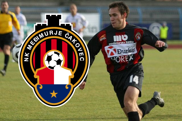
NK Medjimurje is a Croatian football team that is bouncing from division 1 to division 2 and back. They were in need of a new logo that will reflect their name, a region of Medjimurje. Therefore the shield logo is the logo of the region, while the castle on the top is taken from the logo of the city of Cakovec. Red and black stripes reflect the club’s colours.

Baseball club Karlovac is most successful baseball club in Croatia. Locker Room 51 team designed this logo for the anniversary. We also re-branded the team look which we’ll show you in future posts.
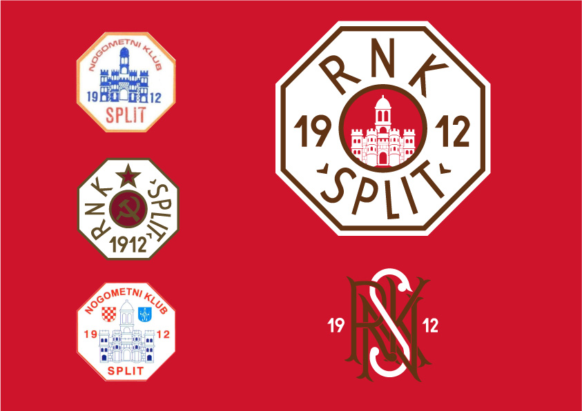
This is a submission for the updated logo for the RNK (workers football club) Split. At Locker Room 51 we only used the elements of the previous crest and created a crest that is free of any political elements with only the crest of the city inside, with the custom font surrounded. The colors of the club are red and white and through the years had blue, black or gold as accent color. We went step farther and took a color of rust as a accent color, to honor the workers (the shipyard workers were among the founders of the club). The secondary logo was created only to show the history of the club, as this kind of logo are associated with clubs with rich history.
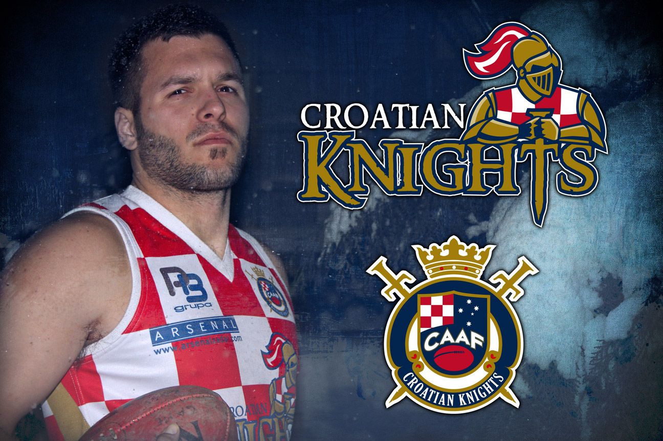
Croatian Knights are Croatian national team in Australian Football. It’s common that “footy” national teams have nicknames. The second logo is federation logo – Croatian Association of Australian Football spotting “chessboard” as symbol of Croatia and Southern Cross symbol of Australia, crown and two swords to represent Knights. At LR51 we gave Knights a 2D retro look, as Knights should be. Knights are very successful in Europe wining silver and bronze in last 2 European Cups.
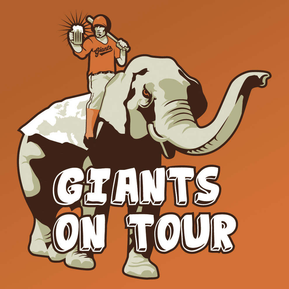
Being a 6 time champions earned Giants a spot at Champions league as well as invitation to friendly tournament. Therefore we made a T-shirt that represent Giants. They are riding a top of European softball, as well as having fun while playing.
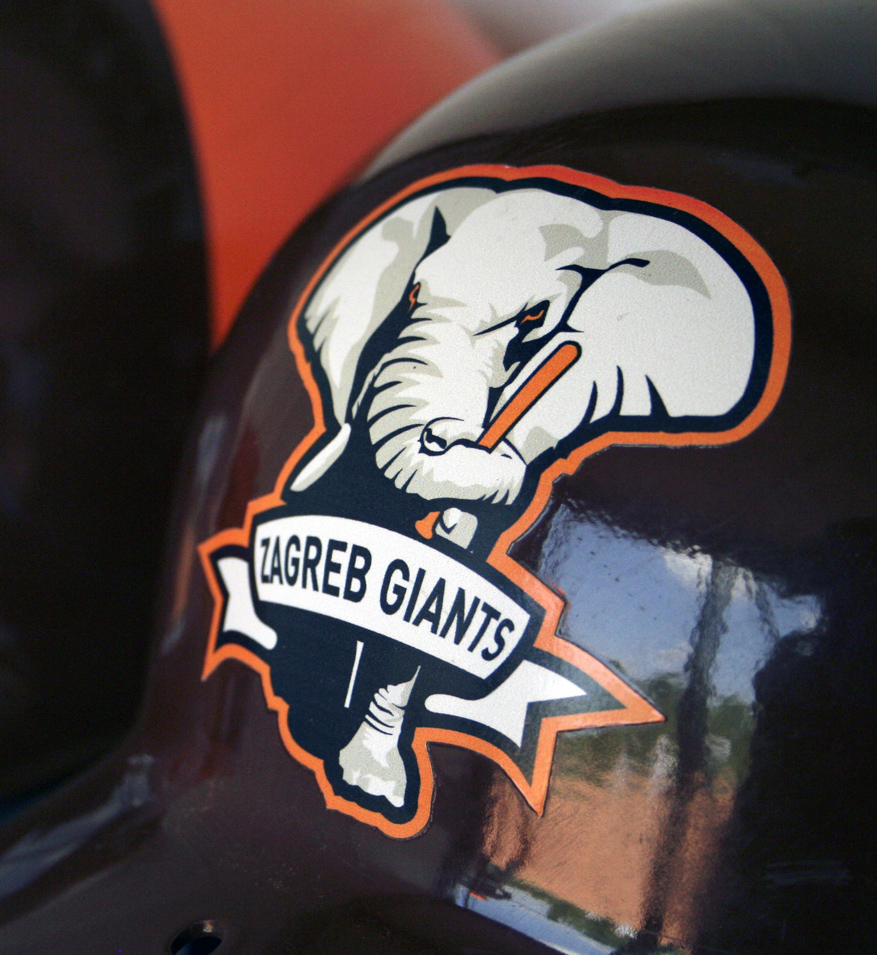
Zagreb Giants are the most successful fastpitch softball team in Croatia. They won 6 championships in a row, only to loose in 2009.The Giants didn’t want to take San Francisco identity so they asked LR51 to make original identity for the team. Front facing elephant represent up and coming Giants. The colors are brown and orange, and the helmets are custom painted in those colors.
